Building an AI analytics dashboard means connecting your business data to a live, intelligent interface that tracks performance, flags problems, and guides decisions without requiring you to dig through spreadsheets every morning. It pulls data from your CRM, marketing tools, and operations into one view and uses AI to surface patterns you would otherwise miss. If you have been making business decisions based on last month’s reports, this guide will show you a better way.
What Is an AI Analytics Dashboard?
A traditional dashboard is a collection of charts. An AI analytics dashboard is different.
It learns from your data. It detects anomalies before they become problems. It forecasts outcomes and gives you context alongside the numbers, not just the numbers alone.
Think of it as your business’s control room. Every department’s data feeds into it, and instead of a static snapshot, you get a living view of what is happening and what is likely to happen next.
The gap between a spreadsheet report and an AI dashboard is the difference between knowing your revenue dropped last month and knowing exactly why it dropped, which customers were affected, and what your team should do first.
Read Also: How Real-Time Analytics Drives Smarter Operational Choices
Why Businesses Are Moving to AI Dashboards
The numbers behind this shift are hard to ignore.
According to McKinsey, 77% of companies are either using or testing AI in 2025. IBM research shows that AI reduces manual data entry time by 80%. Accenture reports that AI-driven automation saves businesses $150 billion per year across industries.
Yet most small and mid-sized businesses are still relying on disconnected tools, weekly email reports, and gut feelings to make major decisions.
According to Forbes, integrating multiple data sources was ranked the #1 marketing data challenge for B2B companies in 2024. That problem does not disappear on its own. It gets worse as your business grows and your data spreads across more platforms.
Gartner adds that 80% of organizations will rely heavily on data by 2025. Businesses that have not built a reliable way to read that data are already behind.
A well-built AI analytics dashboard does not just solve that problem. It turns scattered information into something your team can actually act on.
Types of AI Analytics Dashboards
Before you start building, it helps to know which type of dashboard your business actually needs. Not every business needs the same view.
Executive dashboards show company-wide KPIs designed for leadership decisions. Revenue, customer growth, and operational costs at a glance, without noise.
Operational dashboards focus on daily activity. They track live metrics and alert your team when something is off, like a spike in support tickets, a drop in order fulfillment speed, or a system error.
Marketing analytics dashboards pull in traffic, campaign performance, cost-per-lead, and conversion data from your paid, organic, and social channels into a single view.
Sales analytics dashboards track pipeline health, deal velocity, win and loss ratios, and revenue forecasts so your sales team always knows where they stand.
Customer analytics dashboards monitor behavior, satisfaction scores, churn signals, and retention trends. These are the dashboards that help you catch at-risk customers before they leave.
Financial dashboards follow margins, cash flow, budget versus actuals, and cost forecasting to keep finance and leadership aligned.
You do not need all of them from day one. Start with the one that connects directly to your biggest business question right now.
What You Need Before You Build Anything
Most people skip this part. Then they build a dashboard nobody opens.
Start with your business goals, not your data. A goal like “Increase online customer retention by 15% this quarter” immediately tells you which metrics matter: churn rate, repeat purchase rate, and customer lifetime value. Without that goal, you end up tracking fifty metrics that tell you very little.
Identify your decision-makers. Who will actually use this dashboard every day? A CEO scanning trends needs a completely different view than an analyst drilling into weekly channel data. Design for the person making decisions, not for the person building the dashboard.
Map your data sources. List every system your business uses: your CRM, website analytics platform, email marketing tool, advertising accounts, and customer support software. Understanding what data you have and where it lives is step one of any successful build.
Decide on your update frequency. Some metrics need to be real-time. Others, like monthly revenue trends, are fine on a daily refresh. Trying to make everything real-time adds unnecessary cost and technical complexity, especially early on.
Audit your data quality before connecting anything. If your data is messy before you connect it to a dashboard tool, it will be messy inside the dashboard too. That is a trust problem, and once your team stops trusting the numbers, they stop using the tool.
Good data analytics work always starts with this preparation, long before a single chart is built.
Read Also: Can Small Businesses Benefit From AI and Analytics Techniques?
How to Build an AI Analytics Dashboard: Step by Step
Step 1: Define a Clear Business Objective
Every dashboard should answer a specific question your business is actively asking.
“How is our sales team performing against target this month?” is a good starting point. “Show me all the data” is not.
Write down the one decision this dashboard will help you make. Then identify the three to five metrics that directly inform that decision. Anything outside that list can wait for version two.
Step 2: Connect the Right Data Sources
Start with two or three sources most relevant to your objective. Trying to integrate every tool you use is one of the most common reasons dashboard projects stall at the planning stage.
For a sales dashboard, the right starting point might be your CRM, your email platform, and your finance tool. For a marketing dashboard, it could be Google Analytics 4, your paid ad accounts, and your landing page software.
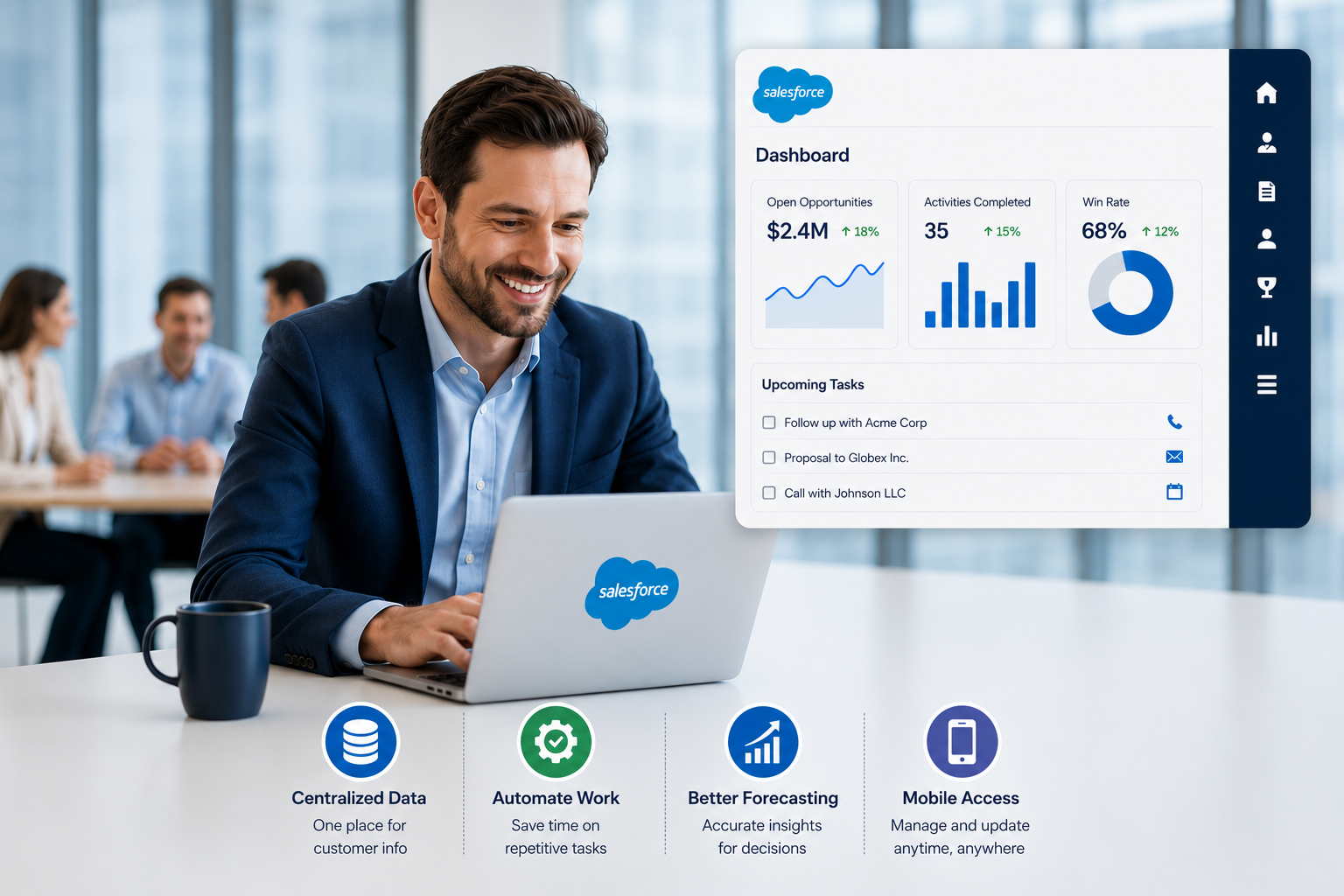
If your business runs on Salesforce, your Salesforce CRM analytics data is one of the richest inputs available. It holds deal history, customer behavior, pipeline velocity, and sales rep performance all in one place, and connecting it to a dashboard layer unlocks a level of visibility most teams do not have.
Step 3: Clean Your Data Before You Build
This step gets skipped regularly. And it is the number one reason dashboards become unreliable within weeks of launch.
Before connecting your data to any tool, remove duplicate records, standardize date formats across systems, and fix inconsistent naming conventions. A customer listed as “ABC Corp” in your CRM and “ABC Corporation” in your billing platform will appear as two separate companies in your dashboard. That kind of error compounds quickly.
AI tools are only as good as the data you feed them. Investing two or three days in data cleaning before you build saves weeks of confusion after you launch.
Step 4: Pick Your AI Dashboard Tool
The right tool depends on your team’s technical skill, your data volume, and your budget. There is no single right answer here.
Power BI works well for businesses already operating in the Microsoft ecosystem. It has strong native AI features, connects to hundreds of data sources, and scales well as your data grows.
Tableau delivers exceptional data visualization capabilities and suits teams that need to explore data deeply rather than just monitor it on a fixed set of metrics.
Zoho Analytics is a practical option for small-to-mid businesses. Its AI assistant lets users pull reports by asking plain-English questions like “show monthly revenue by region” without writing a single formula or query.
DashThis suits marketing agencies and teams that need client-ready reporting quickly, with automated data pulls from major marketing platforms.
Obviously AI is built for predictive dashboards. Upload your data, ask a question, and it returns forecasts and recommendations without any coding required.
For businesses that need something more tailored, custom AI and machine learning services can power dashboards that go well beyond what off-the-shelf tools offer, particularly when you need predictive models trained on your own historical data.
If your business runs on Salesforce, Salesforce Einstein Discovery is worth a close look. It sits directly inside your Salesforce environment and uses AI to predict outcomes like which leads are most likely to close and which customers are showing early signs of churn, before those patterns become obvious to the human eye.
Step 5: Build Your KPI Framework
Resist the urge to add every metric you can think of to the main view.
Your dashboard should show your top three to four KPIs above the fold. These are the numbers that tell the story at a glance. Below that, you add trend charts, segment breakdowns, and drill-down views for users who need to explore further.
A good structure follows a simple logic: show the headline first, then let the user choose how deep to go. Executives stay at the summary level. Analysts drill further. Both groups get what they need from the same dashboard without it feeling cluttered.
For teams building with Tableau specifically, working with an experienced Tableau consulting partner can significantly reduce build time and prevent the layout and performance mistakes that make dashboards frustrating to use at scale.
Step 6: Design for the Person Using It, Not the Person Building It
This is where most dashboards quietly fail. Technically correct, but practically useless.
If the person using your dashboard has to scroll through ten charts to find the one number they check every morning, the dashboard will be abandoned within a month. That is not a user problem. It is a design problem.
Keep the layout clean. Use color to highlight anomalies, not to decorate. Make sure the dashboard renders correctly on mobile because managers and executives often check numbers when they are away from their desks.
Progressive disclosure works well here: show summary-level data by default and reveal advanced filters or breakdowns only when the user explicitly asks for them. This keeps the interface clean for everyday use while still giving analysts the depth they need.
If your business also needs custom interface work around the dashboard layer, UI/UX design and development can make the difference between a dashboard your team opens every day and one that collects digital dust.
Step 7: Test It Against Known Data, Then Launch
Before going live, run the dashboard against data you already know. If your sales team closed $240,000 last month, verify that the dashboard shows exactly that, not $237,800 due to a sync lag or mapping error.
Get real feedback from actual users before calling it done. The most useful question to ask them is: “What did you expect to see here that you did not?” Their answers will tell you exactly what to fix.
After launch, set a review cadence. Quarterly reviews work well for most businesses. Data sources change, KPIs evolve, and business priorities shift. A dashboard left unreviewed for a year becomes a misleading asset, not a helpful one.
Metrics Every AI Analytics Dashboard Should Track
The specific metrics vary by business type, but a solid starting framework covers a few core areas.
Revenue and sales performance gives you the health of the business at a glance. Customer acquisition cost tells you how much you are spending to bring in each new customer. Customer lifetime value tells you whether those customers are worth what you paid to acquire them, and whether your retention efforts are working.
Churn rate and retention rate reveal whether your product or service is actually delivering on its promise over time. Marketing ROI by channel shows you where your budget is working and where it is being wasted. Lead conversion rate connects your marketing activity to your sales outcomes in a way that pure traffic numbers cannot.
For businesses with strong digital operations, website traffic, session quality, and goal completions add important context from a broader data analytics standpoint.
The rule of thumb: if a metric cannot tell you what to do next, it probably does not belong on your main dashboard view.
Mistakes That Slow Down or Kill Dashboard Projects
Tracking too many metrics at once is the most common. When everything feels important, nothing is, and the dashboard becomes visual noise rather than a decision-making tool.
Not cleaning data before connecting it leads to numbers that nobody trusts. Once your team starts questioning the dashboard’s accuracy, they stop using it. That trust is very hard to rebuild.
Building it for yourself instead of your end users is a design trap that even experienced developers fall into. Involve the people who will use the dashboard early in the process, not just at launch.
Ignoring mobile responsiveness is a mistake that becomes painfully obvious the first time a manager tries to pull up a dashboard on their phone during a client meeting.
Not setting a review schedule is the slow killer. A dashboard that reflects your business priorities from eighteen months ago does not just fail to help. It actively creates false confidence in outdated data.
Read Also: Why Do Real-Time KPI Dashboards Boost Executive Decision-Making?
What Results You Can Realistically Expect
Deloitte data shows that AI reduces business operational costs by up to 35%. Accenture reports that AI-driven automation delivers $150 billion in annual savings across global businesses. Gartner projects that by 2026, more than 80% of enterprises will have AI-enabled applications running in production environments.
In practice, for a mid-sized business, the results look more tangible than those headline numbers suggest. Fewer hours spent building manual reports every week. Faster identification of underperforming campaigns before the budget is wasted. Clearer budget allocation decisions backed by actual data. Sales teams are spending their time on the right opportunities instead of guessing which deal to prioritize.
One retail business that implemented an AI analytics dashboard found that a single underperforming product category had been quietly dragging down its quarterly margin for three straight months. Without the dashboard, that pattern would have taken another full quarter to surface through manual review. By the time it showed up in a standard report, the damage was already done.
The real value of an AI analytics dashboard is not just in the numbers it shows you. It is in the problems it catches before they become expensive ones.
Conclusion
Building an AI analytics dashboard for your business does not require a large technical team or an enterprise-level budget. What it does require is a clear business objective, clean data, and a design built around the people who will actually use it.
Define the decision you want the dashboard to help you make. Connect the right data sources. Clean that data before it goes anywhere near a visualization tool. Build around your user, not your data model. Test before launching, and review it regularly after.
The best dashboard is not the most technically advanced one. It is the one your team opens every morning because it tells them something they can act on.
If you are ready to move from scattered reports to a live, intelligent view of your business performance, OzaIntel builds custom AI analytics dashboards tailored to your data sources, your KPIs, and the real decisions your team needs to make. From data visualization and Tableau consulting to full AI and machine learning integration, the team at OzaIntel has helped businesses across industries turn raw data into something they can act on every day. Talk to the team and see what your data can actually do.