Data can reveal a lot about a business, but raw numbers do not always make those insights easy to see. A long spreadsheet may contain important trends, comparisons, or unusual changes that are difficult to identify at a glance.
According to IBM, data visualization uses graphical formats such as charts, plots, and infographics to make data easier to understand and communicate. It can help people recognize patterns, relationships, and trends that may otherwise remain hidden in raw datasets.
When used in business analytics, visual representation makes complex information easier to explore and communicate. It allows teams to monitor performance, compare results, identify changes, and uncover insights that can support more informed business decisions.
What Is Data Visualization?
Data visualization is the graphical representation of data and information using visual formats such as charts, graphs, maps, tables, dashboards, and other interactive elements. The objective is to help users understand what the data means and identify information that may not be obvious when looking at raw numbers.
Consider a company with three years of monthly sales data across six regions. A spreadsheet can store every transaction and monthly total, but identifying the most important trends may require substantial effort. A line chart can immediately reveal whether revenue is rising or declining over time, while a bar chart can make it easier to compare regional performance. The underlying information remains the same, but the visual representation makes it easier to interpret.
That distinction is important because data visualization does not replace analysis. It is part of the process of making analytical results understandable and useful. The quality of the outcome depends on the quality of the underlying data, the analytical approach, the visualization chosen, and the context in which the final result is presented.
A useful data visualization generally has three characteristics:
- Reliable and relevant data forms the foundation of an effective visualization.
- The visual format should match the analytical question being explored.
- Audience needs should guide how the information is presented and interpreted.
A chart created without considering these factors can create confusion rather than clarity. A technically accurate visualization can still be ineffective if it contains irrelevant metrics, uses an inappropriate chart type, or fails to provide enough context for the viewer.
What Does Data Visualization Mean in Simple Terms?
A simple way to understand visualization is to think of it as a translation process. Raw data is the original language, analysis identifies what matters, and visualization presents the result in a form that people can recognize and explore.
Suppose a business knows that customer churn increased from 3.2% to 5.1% over two quarters. That number is important, but it does not explain where the change happened. A visualization can break the result down by customer segment, region, product, acquisition channel, or customer tenure. Once those dimensions are displayed, the organization may discover that churn increased primarily among one customer group.
The visual does not automatically provide the answer. Instead, it helps the analyst see where further investigation should happen.
How Does Data Visualization Work?
A business data visualization process often follows a sequence such as:
Data sources → Data preparation → Analysis → Visualization → Interpretation → Decision
Information may come from CRM systems, ERP platforms, spreadsheets, databases, cloud applications, APIs, or other business systems. Before visualization, that information often needs to be cleaned, combined, structured, and validated. Analysts then identify the measures and relationships that matter before deciding how the information should be presented.
This is why successful visualization is closely connected to data analytics and data modeling. A dashboard is only as useful as the information behind it.
Why Is Data Visualization Important?
The importance of data visualization comes from the fact that businesses often need to understand large amounts of information quickly. A decision-maker may not have time to read hundreds of rows of data or review several separate reports just to determine whether performance is improving or declining.
Visual analytics can reduce that friction by putting important information into a form that can be compared and explored more efficiently. When the right metrics are displayed together, users can often identify changes, trends, and unusual results more easily.
Data visualization can help businesses:
- identify trends and changes over time
- compare departments, products, markets, or customer groups
- detect unusual results and potential problems
- monitor important KPIs
- investigate performance differences
- communicate analytical findings
- support more informed decision-making
The business value comes from what happens after the visualization is created. A sales dashboard may reveal that conversion rates are falling in one region. A finance dashboard may show an unexpected increase in operating costs. An operations dashboard may reveal that delays are concentrated in a particular process.
In each case, the visualization becomes a starting point for investigation.
IBM’s design guidance also emphasizes that effective data visualization should be understandable, essential, impactful, consistent, and contextual. In other words, visual quality is closely connected to usefulness, not decoration.
How Is Data Visualization Used in Business Analytics?
Data visualization plays an important role in business analytics because it helps connect analytical findings with the people who need to act on them. Analytics may involve complex calculations, statistical analysis, predictive models, or data transformations, but those results still need to be interpreted by managers, executives, analysts, and other business users.
For example, suppose a company wants to understand why revenue declined during a particular quarter. Looking only at total revenue may confirm that performance fell, but it does not explain the reason. Additional visual analysis may show that the decline came from one product category, one region, or one customer segment.
The dashboard can then support a deeper investigation into related metrics such as customer acquisition, sales pipeline, conversion rates, pricing, or retention.
This is one reason modern analytics environments are increasingly interactive. Microsoft’s Power BI documentation describes visualizations as building blocks of reports that help users understand patterns, trends, and relationships, while interactive features such as cross-filtering, cross-highlighting, and drillthrough allow people to explore information in greater detail.
Data Visualization in the Analytics Workflow
A practical business analytics workflow may include several connected steps:
1. Collect relevant data
Information is gathered from systems that contain useful business signals.
2. Prepare and validate the data
Data is cleaned, structured, combined, and checked for consistency.
3. Define the analytical question
The team determines what it actually needs to understand.
4. Select metrics and dimensions
The important KPIs, categories, time periods, and segments are identified.
5. Choose the visualization
The visual format is selected according to the question, data type, and audience.
6. Build the dashboard or report
The visual elements are organized into an analytical experience.
7. Interpret and act on the result
Users investigate the information and use it to support decisions.
This process shows why effective data visualization requires more than chart selection. It is part of a larger analytical system.
Common Types of Data Visualization
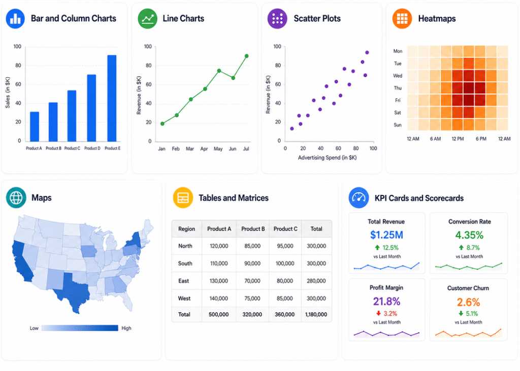
Different types of data visualization are useful for different analytical questions. A common mistake is to treat chart selection as a matter of personal preference. In practice, the visual should match the information users are trying to understand.
Bar and Column Charts
Bar and column charts are useful when the primary task is comparing categories. They can show revenue by region, sales by product, customer accounts by segment, or support requests by issue type.
They are especially effective when users need to compare several categories and quickly identify which values are higher or lower.
Line Charts
Line charts are commonly used to display trends over time. Revenue, website traffic, customer churn, production volume, and operating costs can all be analyzed using time-based visualizations.
They are particularly useful when the question is not simply “Which category is largest?” but “How has this metric changed?”
Scatter Plots
Scatter plots can help users examine relationships between numerical variables. For example, a company may compare advertising spend with revenue or customer engagement with retention.
These charts can reveal clusters, unusual observations, and potential relationships that may deserve further investigation. However, a visual relationship should not automatically be treated as proof that one variable causes another.
Heatmaps
Heatmaps use differences in visual intensity to reveal patterns across two dimensions. They can be useful for customer activity, regional performance, operational behavior, or time-based analysis.
For example, a support team could examine the number of tickets by day and hour to identify periods of higher demand.
Maps
Maps are useful when location is an important part of the analysis. A company could use geographic visualization to understand sales territories, customer distribution, service demand, delivery performance, or market opportunities.
Tables and Matrices
Not every analytical problem requires a chart. When users need exact values or detailed comparisons, tables and matrix-style views can be more appropriate.
This is particularly useful when several categories and measures need to be examined simultaneously.
KPI Cards and Scorecards
KPI cards provide a focused view of a specific metric, such as revenue, conversion rate, profit margin, or customer churn.
They are often used at the top of executive and operational dashboards because they provide quick access to high-priority information.
Interactive Dashboards
Interactive dashboards combine multiple visual elements into a single analytical interface. Users can often apply filters, change time periods, drill into categories, or examine a particular segment without creating an entirely new report.
Microsoft’s current Power BI documentation includes visual types for comparison, trends, relationships, geographic information, KPIs, and other analytical purposes, while interactive controls such as filters and slicers allow users to explore the data dynamically.
How to Choose the Right Data Visualization
Choosing the right visualization begins with the question the business needs to answer. The same dataset may support several visual formats, but each one emphasizes a different aspect of the information.
A good selection process starts by asking what the user needs to compare, investigate, monitor, or explain.
For example:
- Comparison: Use a bar or column chart when comparing categories.
- Trend: Use a line chart when showing movement over time.
- Relationship: Use a scatter plot when exploring two numerical variables.
- Geographic analysis: Use maps when location is important.
- Performance tracking: Use KPI cards, scorecards, or gauges when monitoring progress toward a target.
- Detailed analysis: Use tables or matrices when exact values and multiple dimensions are important.
- Multi-dimensional monitoring: Use dashboards when several related metrics need to be viewed together.
Microsoft recommends considering the data type, analytical goal, audience, and available space when selecting a visual.
The audience deserves special attention. An executive may need a high-level summary with a small number of critical indicators, while an analyst may need filters, drilldowns, detailed dimensions, and supporting data.
The visualization should therefore be designed around the user’s workflow rather than the capabilities of the software alone.
What Makes a Good Data Visualization?
A good data visualization makes relevant information easier to understand without introducing unnecessary complexity.
Clarity is one of the most important principles. A viewer should be able to understand what the visual represents, what is being compared, and why the information matters.
Context is equally important. A revenue value of $2 million might sound impressive, but its meaning changes depending on whether the previous period was $1 million, $3 million, or the target was $2.5 million.
A strong visualization therefore considers:
- the purpose of the visual
- the audience
- relevant comparisons
- appropriate labels
- consistent terminology
- readable design
- accurate scales
- useful context
- an appropriate level of detail
A good dashboard should also create a visual hierarchy. Important information should receive more attention than supporting details. Users should not have to search across a crowded screen to find the metric that matters most.
This is especially important for executive reporting, where the goal is often to identify what requires attention quickly and then provide a path to deeper analysis.
Common Data Visualization Mistakes
Even technically correct dashboards can fail when the design does not account for how people consume information.
Using Too Many Visuals
Adding more charts does not necessarily increase the value of a dashboard. When every available metric is placed on one screen, the result can become difficult to navigate.
Choosing a Chart Because It Looks Attractive
Visual appearance should support communication rather than replace it. A simple chart that answers the right question is generally more useful than an impressive graphic that makes interpretation harder.
Ignoring the Audience
A dashboard built for an analyst may contain too much detail for an executive. At the same time, an overly simplified dashboard may not provide enough information for an analyst trying to investigate a problem.
Using Misleading Scales
Chart scales can change how users perceive differences. Visualizations should represent values accurately and provide sufficient context to prevent incorrect conclusions.
Mixing Inconsistent Metrics
If departments use different definitions for the same KPI, the dashboard can create confusion even if each individual calculation is technically correct.
Ignoring Data Quality
Poor data quality cannot be fixed through visualization design. Missing, duplicated, outdated, or inconsistent information can produce inaccurate conclusions.
For this reason, visualization initiatives should include data validation, governance, and quality checks.
How Data Visualization Supports Different Business Functions
One of the strongest applications of data visualization is its ability to adapt the same underlying information to different business needs.
Sales Analytics
Sales teams can use dashboards to monitor pipeline value, quota attainment, win rates, sales cycle length, conversion rates, regional performance, and product-level results.
Instead of relying on several disconnected reports, managers can use a centralized view to identify where performance is changing and investigate potential causes.
For businesses using Salesforce, Salesforce CRM Analytics Consulting can be used to support analytics and dashboard requirements around CRM data, sales performance, customer information, and predictive insights.
Marketing Analytics
Marketing teams frequently work with information from several channels. Visualization can bring campaign performance, acquisition, engagement, conversion, and customer metrics into a more connected analytical view.
This can help teams understand not only which channels attract traffic, but which channels contribute to meaningful business outcomes.
Financial Analytics
Finance teams can visualize revenue, expenses, margins, budget variance, cash flow, and forecasts.
A well-designed financial dashboard can help users compare actual results with previous periods, targets, or forecasts and investigate unusual changes.
Operations Analytics
Operational visualization can be useful for monitoring productivity, inventory, delivery performance, downtime, throughput, service levels, and process efficiency.
When operational information is updated frequently, teams can identify issues earlier and investigate the areas most likely to affect performance.
Customer Analytics
Customer dashboards can track acquisition, retention, churn, engagement, satisfaction, customer value, and support activity.
Segmenting these measures can help organizations understand where customer behavior is changing and which groups may require additional attention.
Executive Analytics
Executive dashboards are designed to provide a high-level view of company performance. Instead of showing every operational metric, they typically focus on strategic KPIs and indicators of risk or opportunity.
The most effective executive dashboard is often not the one with the most information. It is the one that helps leadership identify what matters and where deeper investigation is needed.
Data Visualization and Business Intelligence
Data visualization is closely connected to business intelligence, but the two concepts are not identical.
Business intelligence covers a broader set of processes and technologies used to collect, manage, analyze, and deliver business information. Data visualization is one of the ways those analytical results can be presented and explored.
A business intelligence environment may combine information from CRM systems, ERP platforms, databases, spreadsheets, and cloud services. Once the information has been modeled and analyzed, dashboards and reports can provide a visual way for users to explore the results.
Microsoft describes Power BI as a business analytics platform for connecting, visualizing, and sharing data and insights across an organization.
This distinction matters because visualization quality depends on the entire analytical environment. A polished dashboard does not guarantee useful insights if the source data, calculations, data model, or business definitions are unreliable.
What Is Data Visualization Software?
Data visualization software provides tools for turning data into charts, reports, dashboards, and interactive analytical experiences.
Organizations typically evaluate these platforms based on a combination of technical and business requirements, including:
- data source compatibility
- integration capabilities
- security
- scalability
- user requirements
- collaboration
- dashboard flexibility
- customization
- analytical capabilities
Popular business platforms include Tableau, Power BI, Salesforce CRM Analytics, and Looker. Each has different strengths depending on the technology environment and the type of analytical work required.
For example, an organization already operating heavily within Microsoft technologies may evaluate Power BI as part of its analytics strategy. A company that prioritizes interactive visual exploration may consider Tableau. A Salesforce-centered organization may place greater emphasis on CRM analytics.
The correct choice should come from business requirements rather than software popularity alone.
Tableau, Power BI, and Salesforce CRM Analytics
Tableau is widely associated with interactive data exploration and dashboard development. It can be used for complex analytical environments where users need to explore data visually and move between different views.
Organizations looking for specialized support can also explore Tableau Services, including dashboard design, data modeling, UX logic, performance considerations, and other implementation requirements.
Power BI provides a broad ecosystem for business reporting and analytics. Microsoft documents built-in visuals for comparisons, trends, distributions, relationships, geographic analysis, KPIs, and custom visualization scenarios.
Salesforce CRM Analytics can be particularly relevant for organizations where customer and sales data are central to reporting. It allows businesses to explore CRM-related metrics and bring analytical context into sales and customer workflows.
The right approach may also combine multiple platforms when different systems serve different parts of the organization’s analytical environment.
How to Visualize Complex Business Data
Business data becomes more complex as organizations add systems, departments, markets, and reporting requirements.
A company might store customer data in a CRM, financial information in an ERP, marketing activity across several platforms, operational data in databases, and additional information in spreadsheets.
Analyzing these systems independently can create fragmented reporting. One team may see a sales decline, another may see a customer service increase, and another may see lower marketing engagement without having a shared view that connects the signals.
An integrated visualization approach can help bring relevant information into a common analytical environment.
For example, suppose revenue falls in one region. A unified dashboard could allow a manager to compare pipeline, conversion rate, customer retention, product performance, marketing activity, and support issues for the same region.
The purpose is not to place every dataset onto one screen. It is to connect the information that is relevant to the business question.
This is an important distinction when dealing with complex business data. Good visualization is selective. It combines information based on relevance rather than volume.
Real-Time Data Visualization
Real-time data visualization is useful when the business situation changes quickly enough that older information can affect a decision.
Examples include:
- active sales pipeline
- customer support queues
- inventory levels
- website activity
- production monitoring
- operational incidents
However, real-time reporting is not automatically the right choice for every use case.
A finance dashboard reviewed monthly may not benefit from second-by-second updates, while an operations environment may require frequent refreshes.
The required refresh rate should therefore be determined by the business decision.
A well-designed system also needs to consider data latency, refresh frequency, processing capacity, and the reliability of the underlying source systems.
Data Visualization and Data Storytelling
A visualization can communicate more than an individual number. When related visuals are designed together, they can guide users through an analytical story.
A useful sequence may begin with overall performance, move into the areas driving the change, and then allow the user to investigate the most relevant segment or category.
For example, an executive dashboard may first show revenue and profitability. Additional visuals can then show which regions or product categories affected the result, with filters allowing users to explore specific areas.
This creates a path from observation to investigation.
Data storytelling does not mean hiding complexity. It means organizing information so that users can understand the relationship between the metrics and the business issue.
Data Visualization for Executive Decision-Making
Executives often need concise information first and detailed information second.
An executive dashboard may therefore start with several high-priority KPIs before providing access to supporting trends and underlying details.
The most useful structure is often layered:
- Overview: What is happening?
- Context: Is performance improving or declining?
- Investigation: Where is the change occurring?
- Detail: What factors may explain it?
This approach gives leadership a faster way to identify areas that deserve attention while preserving access to the information analysts need for deeper investigation.
When Should a Business Consider Custom Data Visualization Services?
Standard visualization tools can solve a wide range of reporting needs, but some businesses require more specialized solutions.
Custom data visualization may be appropriate when the organization needs to combine multiple business systems, create role-specific dashboards, support specialized KPIs, build custom user experiences, embed analytics into applications, or provide a reporting environment that follows a specific operational workflow.
Common signs that standard reporting may no longer be sufficient include:
- Teams rely heavily on manual spreadsheet reporting.
- Important data is spread across multiple systems.
- Executives lack a unified view of performance.
- Different departments need different dashboard experiences.
- Existing dashboards contain too much information but little context.
- Users need real-time or frequently refreshed reporting.
- Standard BI visuals do not support a required workflow.
- Analytics need to be embedded into another business application.
A Data Visualization Services solution can be designed around these requirements, including executive and department dashboards, interactive reports, insight storyboards, custom visualization templates, real-time reporting, and integration with systems such as Salesforce, Tableau, Power BI, Python, and SQL.
The goal of custom visualization should not be to make dashboards more complicated. It should be to make them more relevant to the people and decisions they are designed to support.
How to Build an Effective Data Visualization Strategy
A strong data visualization strategy begins with the business problem rather than the tool.
The first step is to identify the decisions that require better information. This helps prevent organizations from creating dashboards simply because data is available.
Next, the team should determine who will use the visualization, what information they need, and how they currently make decisions.
The relevant data sources should then be identified and assessed for quality, consistency, accessibility, and update frequency.
Once the data foundation is understood, the organization can identify the most important KPIs and determine which visual formats will make those measures easiest to understand.
A practical process can include:
- Define the business questions.
- Identify the intended users.
- Map the relevant data sources.
- Validate data quality and definitions.
- Select the KPIs that matter.
- Match visualizations to analytical questions.
- Design the dashboard around the user’s workflow.
- Test with real users.
- Measure adoption and usefulness.
- Refine the dashboard as business requirements change.
This approach reduces the risk of building dashboards that look good but fail to solve the underlying business problem.
How to Measure the Value of Data Visualization
The value of the dashboard should be evaluated through business outcomes rather than visual appearance.
One useful measure is reporting efficiency. If employees previously spent several hours collecting data and preparing reports manually, organizations can compare that effort with the time required after automation and visualization.
Accessibility is another important factor. Users may be able to answer questions more quickly when important information is available in a shared dashboard rather than spread across separate files.
Adoption also matters. Dashboards that are rarely used may need to be redesigned, even if the technical implementation is correct.
Organizations can also evaluate whether dashboards help users identify problems earlier, investigate performance more efficiently, and make decisions with better context.
The right measurement framework depends on the purpose of the visualization. A sales dashboard might focus on pipeline visibility and conversion analysis, while an operations dashboard might be evaluated through productivity, service levels, or downtime.
The Future of Data Visualization
Data visualization is evolving alongside business intelligence, cloud analytics, machine learning, and artificial intelligence.
Traditional dashboards are largely focused on showing what happened and what is happening. Modern analytics increasingly extends that capability by helping users investigate why something happened, identify unusual patterns, and explore possible future outcomes.
AI-assisted analytics may also change how people interact with dashboards. Instead of manually navigating multiple reports, users may increasingly ask analytical questions through natural-language interfaces and receive answers supported by data and visual context.
Microsoft’s current Power BI visualization documentation already includes AI-powered visuals, advanced analytical capabilities, forecasting, anomaly detection, and support for custom visual experiences.
These developments do not make traditional data visualization irrelevant. They increase the importance of designing clear analytical experiences that connect data, context, interaction, and decision-making.
The organizations that gain the most value will not necessarily be the ones with the largest number of charts. They will be the ones that build trustworthy data foundations and create visual experiences around meaningful business questions.
Frequently Asked Questions About Data Visualization
Data visualization is the process of presenting information through charts, graphs, maps, dashboards, and other visual formats. It helps people understand complex datasets by making trends, patterns, comparisons, and relationships easier to identify. In business analytics, effective visualization turns analytical information into clearer insights that can support faster and more informed decisions.
Data visualization is the process of presenting information through charts, graphs, maps, dashboards, and other visual formats. It helps people understand complex datasets by making trends, patterns, comparisons, and relationships easier to identify. In business analytics, effective visualization turns analytical information into clearer insights that can support faster and more informed decisions.
Businesses use data visualization for sales, marketing, finance, operations, customer analytics, and executive reporting. Dashboards can combine information from multiple systems and present important metrics in one place. This allows teams to monitor performance, identify changes, investigate potential problems, and understand business trends without relying entirely on spreadsheets or static reports.
Common types of data visualization include bar charts, column charts, line charts, scatter plots, heatmaps, maps, tables, KPI cards, and interactive dashboards. Each format serves a different purpose. For example, line charts are useful for trends, while bar charts support category comparisons. The right visualization depends on the data and analytical objective.
Choosing the right visualization starts with understanding the business question. Bar charts work well for comparisons, line charts for trends, scatter plots for relationships, and maps for geographic analysis. You should also consider the audience, data complexity, reporting objectives, available space, and whether users need interactive exploration or detailed analysis.
A data visualization dashboard is an interactive interface that combines charts, KPIs, tables, filters, and other visual elements. It provides users with a centralized view of important information and allows them to monitor performance, identify trends, and investigate specific areas. Dashboards can be customized for executives, departments, analysts, or operational teams.
Business intelligence is the broader process of collecting, managing, analyzing, and delivering business information. Data visualization is one component of business intelligence that focuses on presenting analytical results visually. BI platforms may use dashboards, charts, and interactive reports to help users explore information and understand patterns, trends, and business performance.
The best data visualization tool depends on an organization’s data sources, technology environment, security requirements, users, and reporting needs. Popular business platforms include Tableau, Microsoft Power BI, Salesforce CRM Analytics, and Looker. Businesses with specialized requirements may also consider custom visualization solutions when standard tools cannot provide the required functionality or user experience.
A business may need custom data visualization when standard dashboards cannot meet its reporting or analytical requirements. Common reasons include multiple data sources, specialized KPIs, role-specific dashboards, custom interactions, real-time reporting, embedded analytics, or complex workflows. Custom solutions can create visualization experiences specifically designed around how teams access, interpret, and use business data.
Data visualization helps decision-makers understand important information through clear comparisons, trends, relationships, and performance indicators. A well-designed dashboard can reveal potential risks, opportunities, and areas requiring investigation. By connecting relevant metrics with business context, visualization helps teams interpret data more effectively and make decisions based on clearer, more accessible evidence.
Conclusion
So, what is data visualization? It is the process of transforming data into visual information that people can understand, investigate, and use. In business analytics, this can range from a straightforward chart showing a sales trend to a sophisticated interactive dashboard that combines information from multiple business systems. The purpose is not simply to display numbers differently. It is to make meaningful information easier to recognize and connect with business decisions.
A successful data visualization strategy combines reliable data, appropriate visual formats, clear context, thoughtful dashboard design, and an understanding of the people who will use the information. When businesses need more than standard reporting, custom Data Visualization Services can provide dashboards, interactive analytics, visualization templates, and integrated reporting experiences designed around specific business requirements. The strongest visualization is ultimately the one that helps users understand what is happening, investigate why it matters, and decide what to do next.